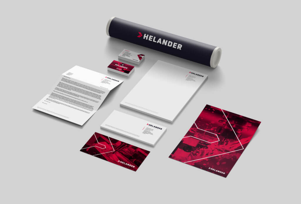
Helander has 40 years’ experience as a key provider of precision components and engineered solutions in the Aerospace & Defence, Oil & Gas, and Nuclear markets. Glow produced Helander’s new brand at the end of last year, and we’re excited that we’re now able to showcase the design.
During the design process, Helander was keen to see an option that retained a connection to the original brand but with a modern and up-to-date aesthetic. Helander has always been associated with its red logo and they wanted to continue to stand out amongst their competitors, many of which tend to stick with the blues and greys that we frequently see in the engineering industries.
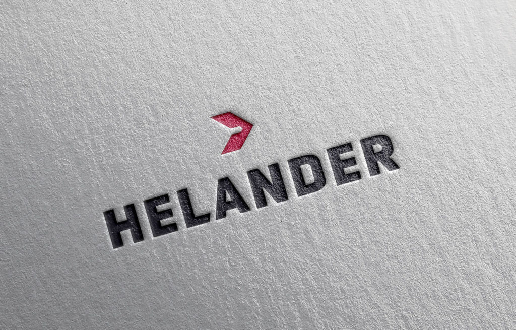
Wanting to appear strong, stable and proud of their history, Glow opted for a contemporary, chunky typeface to create a stamp-like design, in an extremely dark navy colour for a corporate feel.
This was then paired with a red icon to create a connection to the original brand. However, we opted to use a red with warmer notes to create a sense of approachability. Helander was keen to convey its friendly nature while still appearing professional.
The icon itself is a simple, abstract rendition of a drill bit, used frequently in precision engineering. It also has connotations of an arrow suggesting movement and a forward-facing progression, as well as looking like an aircraft; linking to the aerospace industry, a market Helander works within.
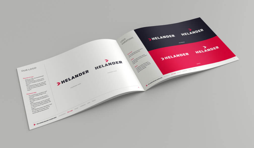
After the logo was approved, we set to work on a series of brand guidelines, Microsoft templates and documents to ensure Helander can begin using its new brand seamlessly. We know the team is excited to get ordering the new uniforms, and we can’t wait to see them either!
It’s not the first engineering brand we’ve worked on. We frequently work with Aquila Nuclear Engineering too.
We absolutely adore this brand and love seeing it all come together, the new Helander website is already in development.


