Marking a milestone matters. Anniversaries are moments to pause, reflect, and celebrate progress, and visually, they deserve more than a line of copy or a social post. This is where a well-considered anniversary logo comes into its own.
We’re often asked to create anniversary logos or sub-logos for clients who already have established branding. Rather than redesigning everything from scratch, the aim is to build on what already exists. A strong anniversary logo keeps the original brand recognisable while giving it a clear, time-specific role that works across campaigns, events, and communications.
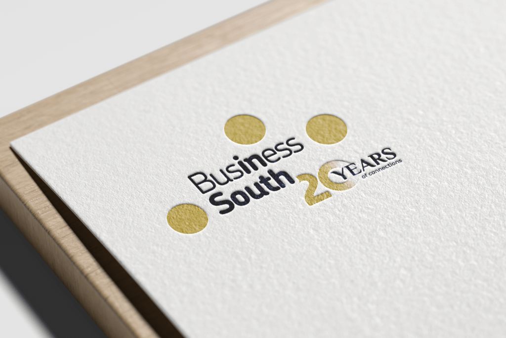
This recent example was created for Business South, celebrating 20 years in business. It’s a significant achievement and one that deserved to be clearly and confidently marked.

Business South is a membership organisation supporting businesses across the South of England. Through events, peer networks, and partnerships, they focus on connection, collaboration, and long-term growth for their members. Over the past two decades, they’ve built a strong reputation for bringing people together and championing regional business communities.
For their 20-year milestone, the anniversary logo needed to feel celebratory but credible. The solution was a refined adaptation of the existing logo rather than a departure from it. This ensured consistency across all touchpoints while giving the anniversary its own visual presence.
A successful anniversary logo should do several things well:
Retain the integrity of the original brand
Clearly signal a milestone or celebration
Be flexible enough for use across print, digital, events, and social
Have a defined lifespan, so it enhances rather than replaces the core identity
In this case, the anniversary logo was designed to sit comfortably alongside Business South’s existing branding throughout their celebratory year. It could be applied to event materials, social media graphics, presentations, and marketing collateral, helping to unify everything under one recognisable visual marker.
One of the biggest advantages of an anniversary logo is clarity. It gives audiences an immediate visual cue that something important is being celebrated, without needing lengthy explanation. It also helps organisations make the most of milestones they’ve worked hard to reach.
Anniversaries come and go, but the way they’re marked leaves a lasting impression. A thoughtfully designed anniversary logo is a simple, effective way to honour the past, celebrate the present, and signal confidence in what comes next.
If your organisation has a milestone on the horizon, an anniversary logo could be the perfect place to start.


