We’re thrilled to announce a milestone moment for Knights Brown!
In celebration of Knights Brown Day on September 1st (exactly seven years after launching the Glow-designed brand) we’re excited to unveil its brand-new website!
This site beautifully reflects Knights Brown’s commitment to its people, its projects, and the values that drive it forward. We’re incredibly proud of the result and grateful to everyone who contributed to bringing this vision to life.
We invite you to explore the new website and share your thoughts with us!


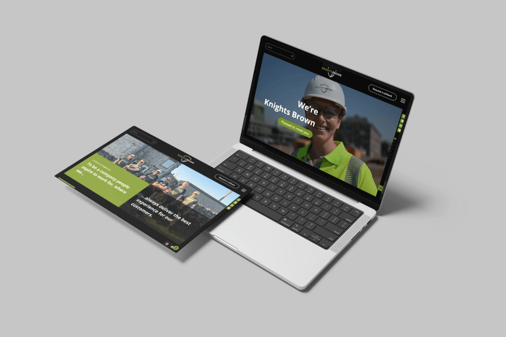
The site design for Knights Brown reflects a professional and modern aesthetic, tailored to showcase the company’s expertise in construction and engineering. The homepage features a clean, minimalist layout with a prominent full-width banner displaying high-quality images related to the construction industry. This visual immediately communicates the company’s industry focus.
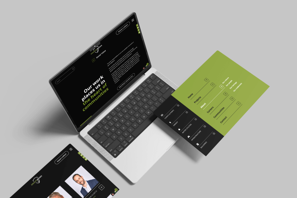
The site employs a consistent color scheme of black and green, conveying Knights Brown’s strong brand presence. Navigation is intuitive, with a well-organized menu that focuses on culture, people and heritage.
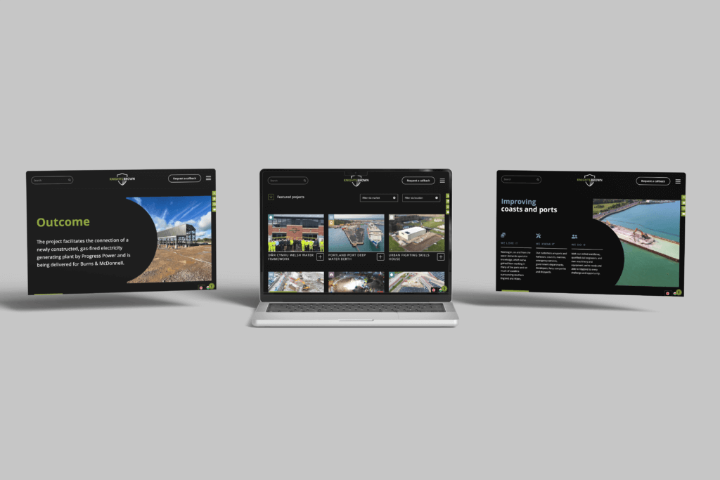
Scrolling down, the homepage offers brief overviews of the company’s services, recent projects, and core values, each accompanied by professional images and video (also created by Glow) and subtle animations that engage the viewer without overwhelming them. The use of blank space is strategic, allowing content to breathe and making the site easy to read.
The footer is comprehensive, containing links to social media, contact information, and additional resources like their privacy policy. Overall, the design is functional and user-friendly, perfectly aligning with Knights Brown’s brand as a trustworthy and capable construction partner.


