The Importance of Colour in Graphic Design
The Basics
Colour choice can make the critical difference between your customers being immediately drawn to your brand, campaign and marketing materials or simply not noticing. Here at Glow, we understand the importance of colour and working with brand guidelines, and we’re here to show you how to best utilise it, in order to enhance your business.
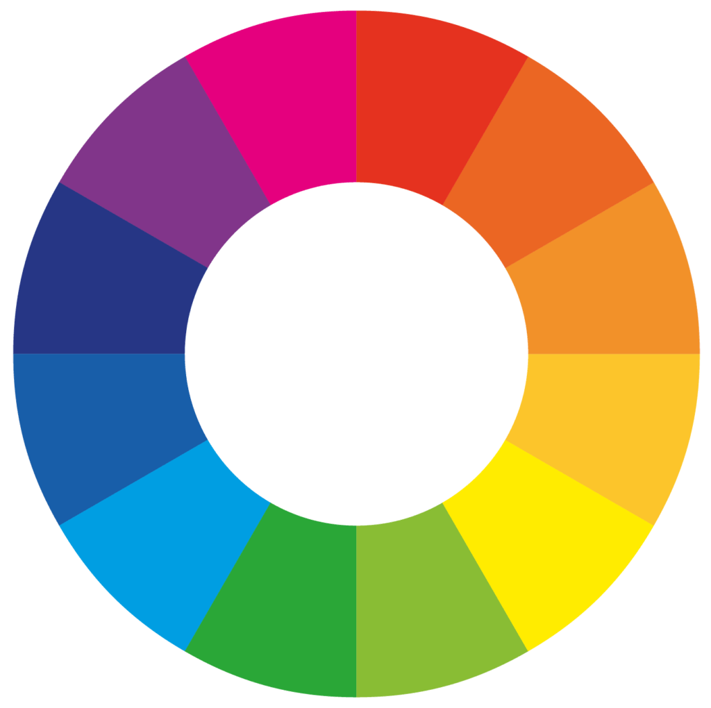
Firstly, let’s look at the colour wheel. The colour wheel helps us to find ideal combinations and colour schemes.
In addition to this, there are various colour rules, which provide further assistance when choosing the best palette for your business. Here are some of the common terms:
Monochromatic: various shades, tones, or tints of one colour; for instance, a range of blues varying from light to dark.
Complementary: opposites on the colour wheel, such as blue and orange. This is a useful combination if you wish to create a striking look.
Triadic: any three colours that are even spaced on the colour wheel. The goal with this is harmony and a dynamic balance.
Client Consideration
When choosing the colours to best represent your business, it is important to consider what combinations would attract the right clients or customers. Colour helps with brand recognition and creating yourself a recognisable backdrop for your business will make you stand out against the others.
Let’s go through some of the common colour associations and how they could suit your business:
Blues: Security, Trustworthy, Stability, Loyalty, Wisdom, Confidence, Friendliness, Preservation, Courage, Science
Greens: Wealth, Money, Calming, Ambition, Endurance, Healing, Calm, Generosity, Natural, Completion, and Protection
Reds: Energy, Power, Vigour, Leadership, Courage, Passion, Activity, Joy
Yellows: Optimism, Childish, Freshness, Law, Education, Vibrancy
Pinks: Playful, Creativity, Love, Beauty
Purples: Royalty, Luxury, Power, Ambition, Wealth, Wisdom, Creativity, Mystery
Oranges: Cheerful, Passion, Pleasure, Enthusiasm, Fascination, Creativity, Fun
Black: Powerful, Mysterious, Elegant, Sophisticated, Functional
Although these are quite broad connotations, combining some of these colours or utilising the different tones can really help enhance your brand.
Shades of dark blues and muted colours suit the corporate world fantastically. Navy blues denote loyalty and preservation. This lends itself to a corporate brand, as it is still professional, but asserts a level of approachability.
When we think of black, we think of it as being the epitome of sophistication and professionalism, this is why a lot of high-end fashion houses opt for simplistic black design to portray a level of regal functionality.
If you’re a creative business (like us!) considering brighter and vibrant colours such as yellows, oranges and pinks can showcase your creative flare before anyone has even seen your portfolio.
If you would like to insert some fun and vibrancy into your brand, an excellent consideration is using a vivid colour on top of a muted shade. Grey is a fantastic shade to use as a base and is great to make a colourful logo or font stand out.
If you’d like to find out more about how we can create an ideal colour palette for your business, don’t hesitate to get in touch!
Click here to check out our blog on the different colour formats for print and web.