Navis Consulting provides specialist Maritime recruitment and is based locally in Port Solent, Portsmouth. They will be expanding to New York in July, so what better time to give the company a modern makeover. Navis is part of the international company STR Group (who we’ve also recently re-branded) and is one of their six micro-specialist staffing companies, and the first of five STR brands that we’re re-branding.
We met with the Navis team in January to discuss their current branding and what they wanted to portray and achieve with the new brand. From this, we established they were keen to retain some elements of their original logo, such as the primary colour scheme and boat hull icon. They wanted a modernised evolution of their brand, which conveyed their strength in the market place.
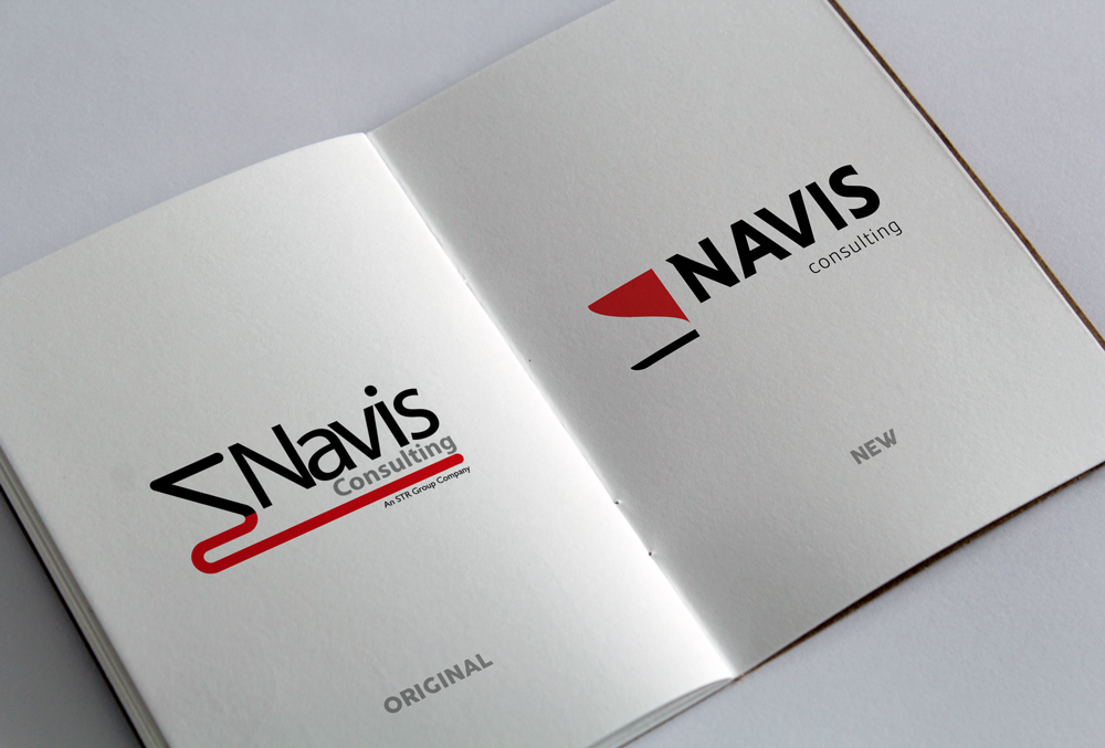
This was an exciting re-brand and the result is a much more powerful logo, through the choice of a capitalised, customised typeface (take a look at how the ‘N’ brings the two parts of the logo together and also nicely mimics a ship’s hull). This is teamed with the smaller subtext ‘Consulting’. The hierarchy on these two elements is now much more balanced and has been given more breathing space, ensuring the logo has a fresh, modern feel. This has also significantly improved the legibility of the text.
The original logo featured a boat hull as a subtle design element, however the client informed us it was often mistaken for a letter and they didn’t feel it was easily recognisable. In addition, when the logo was reversed out in a white format, there was no way of distinguishing between the top and bottom section.
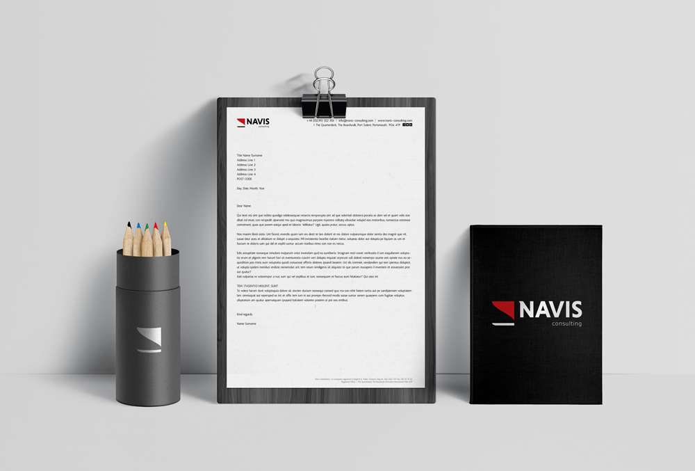
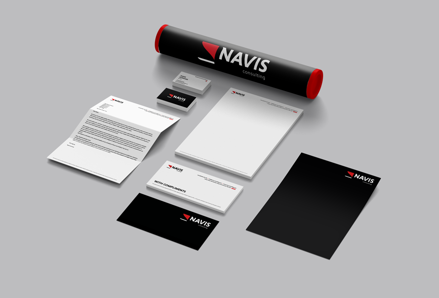
The icon we have created is minimalistic and simple, but holds a level of strength due to the block-like style. The eye naturally fills the negative space created between the two sections and so a square is created. The combination of the straight edges and soft curves creates a great balance of uniformity and approachability. The logo is much more versatile and easier to align than the original (an issue Navis flagged with us in our initial concept design meeting). This means it can be used in both its standard version and a stacked variation, which is ideal for social media and for when space is limited. The icon is also used as a design embellishment on stationery.
We have used the original primary colour palette of red and black, as we believed it was very successful in demonstrating strength and leadership and also related well to their target market.
Not only have we created their new logo, we have also produced all related stationery and brand guidelines to ensure the brand remains consistent.
We’re starting to see the new brand rolled out across their refreshed website and all marketing materials, how exciting!
If you’d like to see how the design has been implemented, check out their website which will show you the brand in context and will give you a little more background information on
Navis Consulting.
#Branding #Logo #Graphic #Design #Digital #Print #BrandIdentity