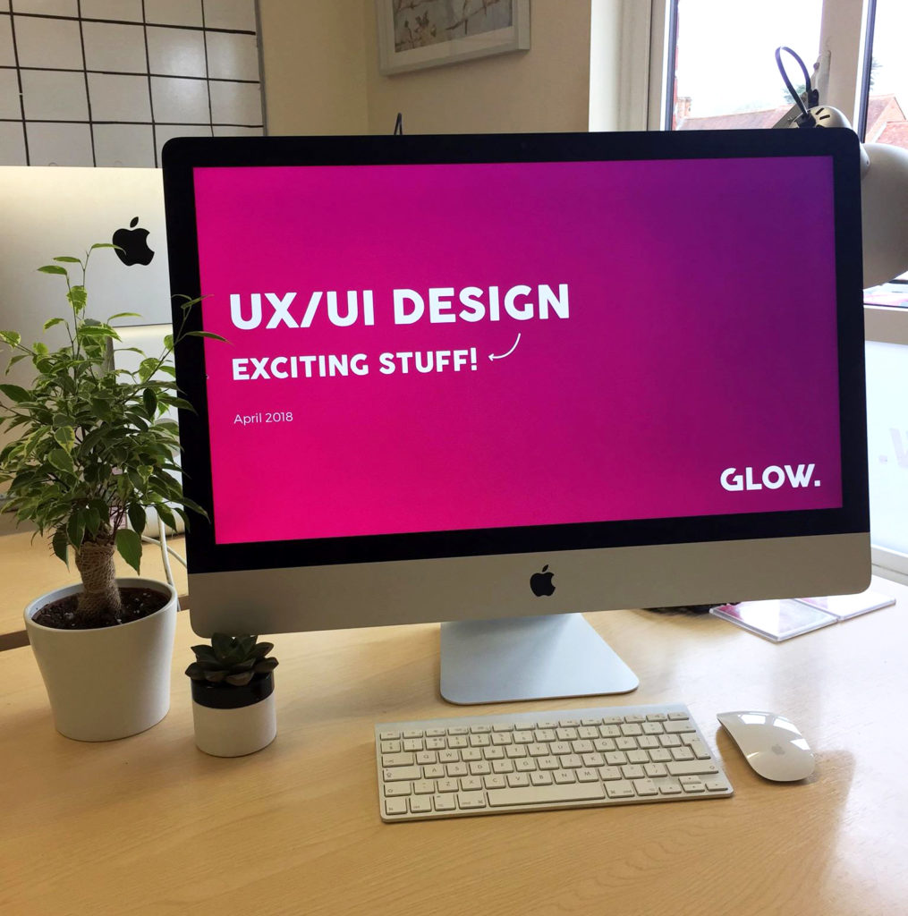
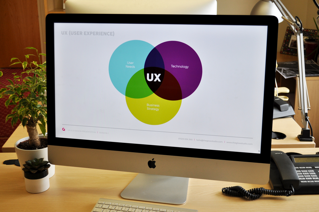
In the studio this week our designers have been taking a closer look at UX and UI. What exactly are these terms I hear you ask? UX stands for user experience’ and is a phrase predominantly used in the digital world, (however it can apply in other industries). It is the internal experience that a person has as they interact with every aspect of a company’s product or service. It includes the practical, experiential and valuable aspects of human–computer interaction. Therefore, it is a vital consideration when building, designing or maintaining any website, app or software.
User experience is a constantly evolving process, in which enhancing customer satisfaction and loyalty is the main objective. This is achieved by improving the usability, ease of use and the pleasure provided in the interaction between the user (that’s you) and the product (perhaps a swanky new app you have recently installed).
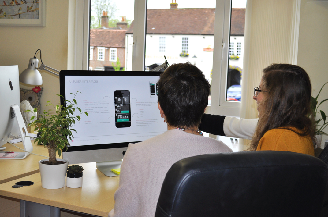
UI (User Interface) on the other hand is the digital interface on a device that the customer interacts with. You use an interface any time you navigate around a website, upload a great new shot to an app (let’s say Instagram for example) or create anything from a spreadsheet to a brochure using the software tools in a whole variety of different programmes.
So, now you know the basics are you intrigued to find out more? (We hope so, as it is very interesting). There is so much to UX and UI, however they are processes that we often take for granted. Do you ever stop to consider the depth of thought and innovation that has gone into creating all the individual elements and icons of an interface? Or the positioning of each section in a website and the routes you can take to navigate it? Most likely not, as it is something that has seamlessly been integrated into the products and devices we use on a daily basis; this is the beauty of UX and UI. Products designed using these processes generally ensure that the interaction is easy and accessible, and the aesthetics are visually pleasing, resulting in a positive experience for the user.
A UX designer’s role covers many different areas, so to make it a little easier to digest, we’ve summarised to the six main responsibilities.
- Product Research (including user and market research)
- Interviews with users and stakeholder
- Surveys
- Focus groups
- Competitor analysis
- Creating Personas and Scenarios
- Identifying the main user groups
- Creating fictitious identities which reflect users that they’re designing for
- Creating scenarios that describe the reason/context behind why a user would come to the site, app or programme and what their goals are
- Information Architecture
- Building the structure for the product
- Design which takes into consideration usability and findability
- Navigation routes, hierarchies and categories
- Wireframes
- Simple representations of each screen and the elements used
- Outlining steps a user might take during interaction
- Visual guides to assist in the development of the final product
- Prototyping
- More detailed, interactive representations of the site, app or software
- Can be used in user testing
- Product Testing
- Testing to establish if there are any issues when users interact with the product
- Behaviour observation and analysing of feedback
- Implementing improvements based on test results
So, we’ve covered UX but what about UI. User interface design is much more visually orientated. Again, there are many areas involved in UI design, so we have chosen what we believe are the most seven important aspects:
- Visual Design – the aesthetic style of the product and the arrangement of fundamental elements.
- Chunking – the breaking up of content into small, distinct units of information. The max amount on a single page should be between 7-9 elements.
- Colour – colour schemes need to take into consideration clarity, versatility, accessibility, responsiveness and branding.
- Typography – the selection of suitable typefaces with appropriate sizing and spacing for the website, app or software.
- Buttons – designed to be appropriate for the average finger pad size and vital as call to actions.
- Icons – representative symbols which help aid scannability and save space. They can also aid the visual design.
- Branding – creating a product that adheres to the business’ brand identity.
At Glow we are keen advocates of following the latest principles of UX and UI. It’s how we create our beautiful websites, digital banners and social media graphics. Keep an eye out for future blogs as we’ll keep you posted on new developments. Chunking is next up – it’s very excting!