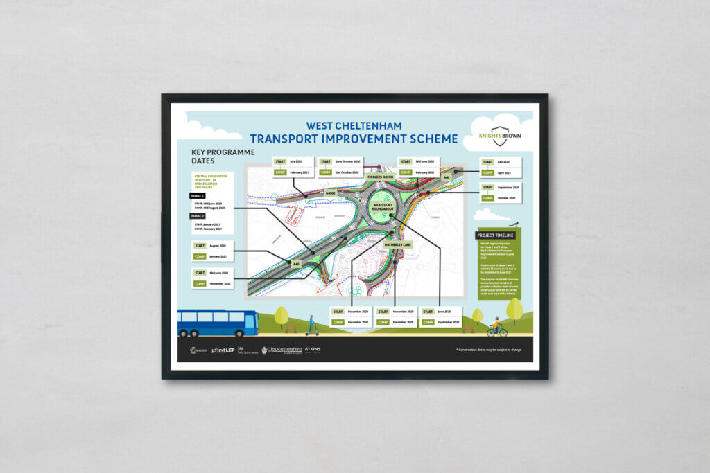
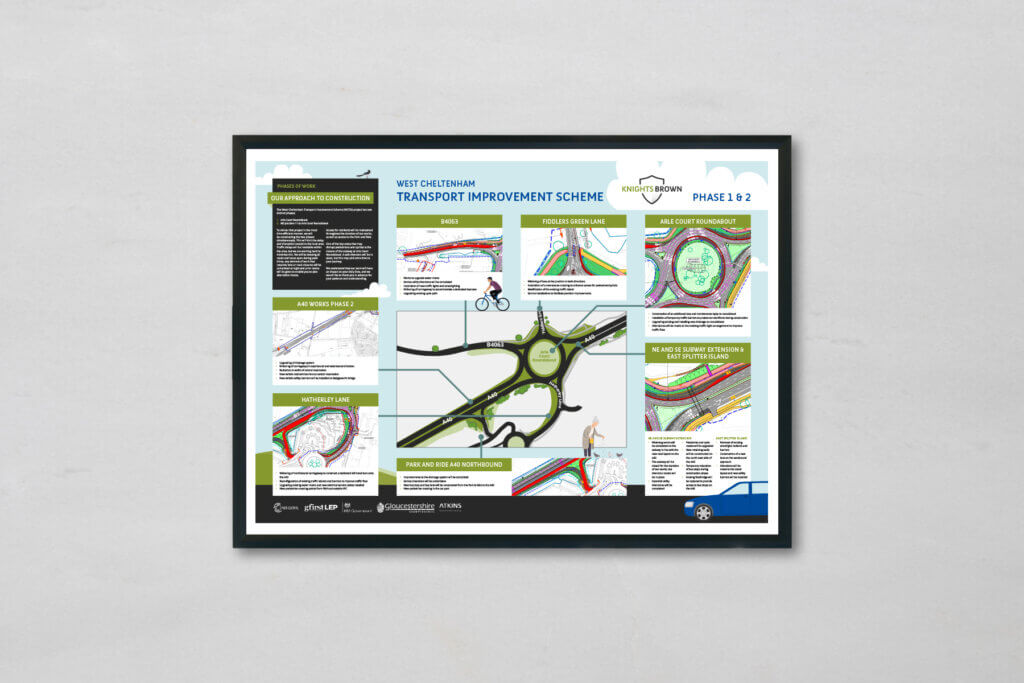
This week we’ve created a set of construction noticeboards for our long-standing client, Knights Brown. The first board introduces the Transport Improvement Scheme, which will be undertaken in West Cheltenham. The second presents the different phases of construction and the third provides details of the key dates associated with the project.
The designs use Knights Brown’s strong brand identity and recognisable colour palette, utilising vector illustrations to show how transport, cycling and pedestrian routes will be improved through the scheme. A custom drawn map has also been created for use on the Construction board to easily display the areas of reference within the text.
As with all of the noticeboards we create for Knights Brown, we have broken the content down into distinguished sections to make the information much easier to digest and more visually appealing.
This suite of boards needed to not only use Knights Brown’s branding, but also reflect the brand identity of Gloucester Council, who is funding the scheme. We have integrated the Council’s primary brand colours into the design, along with the relevant logos in order to show that the two are working in conjunction with each other.
These A1 boards would normally be printed and on display for the public to view, however, due to the current situation, Knights Brown has come up with a fantastic way to still make the noticeboards and information accessible by presenting them in a virtual showroom.


Knights Brown
Knights Brown is a privately owned, full service, regional construction business with specialist energy sector capability delivered nationwide. Its vision is to be a company people aspire to work for, that always endeavours to deliver the best experience for its customers.
Check out some other recent work we have produced for Knights Brown:


