Today we’re looking at ‘the one that got away’, specifically relating to the Alecto leaderboard concept design.
When beginning a new design project for a client, our design team at Glow produce two (sometimes more) concept ideas. Both designs will take direction from the brief outlined by the client. However, the designer’s interpretation and personal styling mean that each concept will always be unique, with varying thoughts and reasoning behind the aesthetics.
With more than one concept being created, and only one selected, there is always going to be ‘the one that got away’ and we have to wave goodbye to a much-loved concept.
Earlier in 2018, we were tasked by our clients, Alecto Recruitment to design a large leaderboard vinyl, to be applied directly to the office wall. The brief provided was very open, which meant lots of room for creative freedom. Our designers love this, as we don’t often get the chance to go completely wild with our ideas. We were provided with the dimensions, content for the leaderboard categories and the styling requirement of simply ‘Wowing’ the Alecto team. Challenge accepted!
We’ve worked with Alecto recruitment for a number of years and it’s a young and upbeat company, so we wanted to provide them with concepts which really packed a punch and had a fun, engaging style.
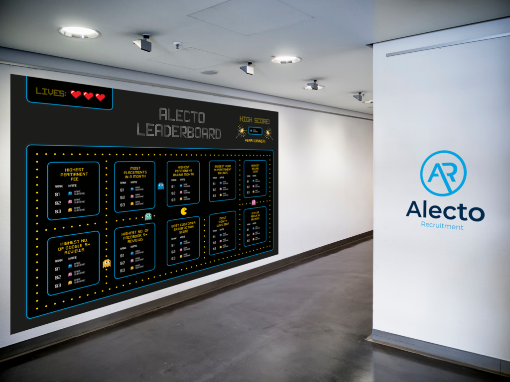
Below are the two concepts. When Alecto received the designs, they were thrilled with both ideas, but immediately fell in love with the first concept (Pac-Man game styling). Being iconic retro game fanatics, the team at Alecto were eager to proceed with the design. You can see why, who wouldn’t want a wall which celebrates its staff performance in such a quintessentially cool way – a real conversation piece.

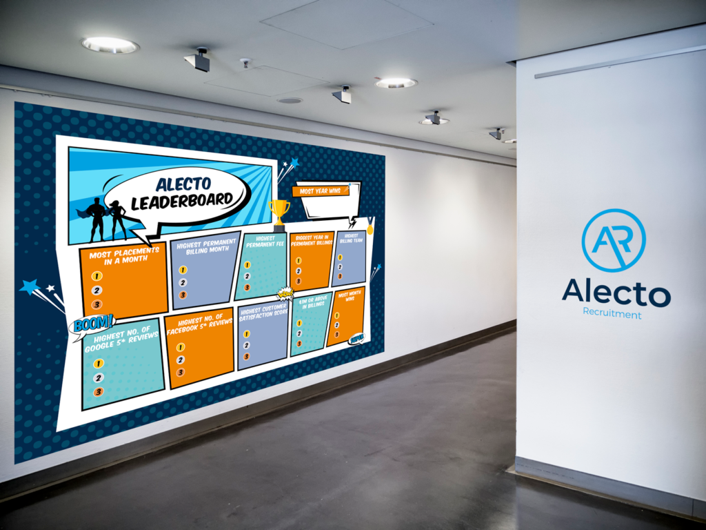
The second concept featured a vibrant comic book style theme, utilising the Alecto primary and secondary colour palette (the colour palette was also created by us as part of their exciting Glow rebrand). The concept created was intended to be visually interesting, with various design enhancements such as classic comic style speech bubbles, themed vectors, dynamic angles and bold patterns. The thinking behind this idea, was to provide artwork that really grabbed your attention.

So which concept was the one that got away? All is revealed on Alecto’s Facebook Page.


