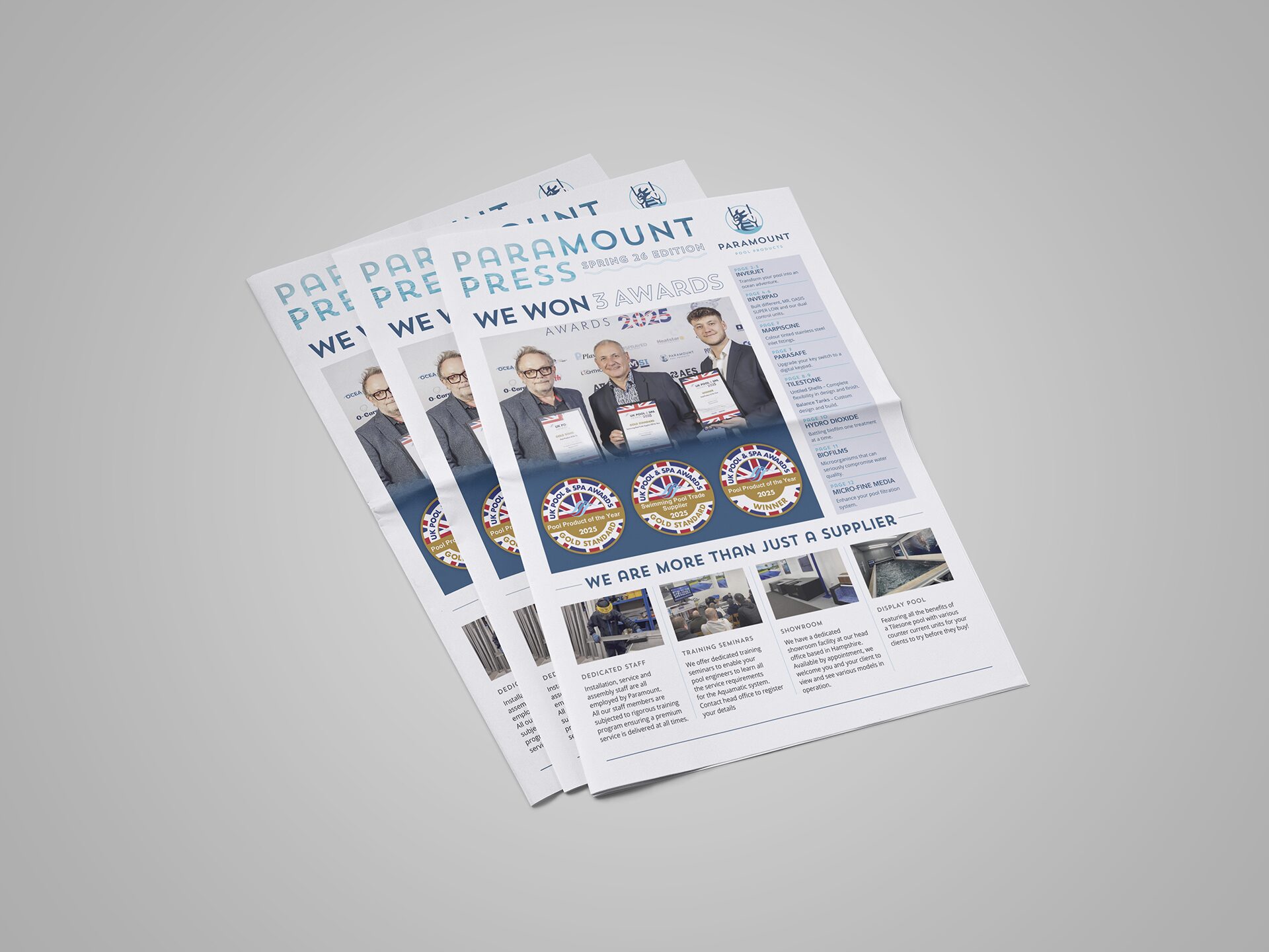
Using a consistent typeface unifies your brand identity, which people will recognise.
Why typeface consistency matters:
- Brand recognition: Using the same typefaces helps people instantly recognise your brand.
- Professionalism and trust: Consistent typefaces make a brand more reliable and organised.
- Emotional connection: Typefaces can evoke different feelings. Consistently using them reinforces the emotional tone you want for your brand.
Effects of typefaces consistency
Consistent typefaces make a brand visually appealing and improve its communication effectiveness. Plus, using the same fonts everywhere makes the brand easy to recognise across different platforms.
Implementing typefaces consistency:
- Choose wisely: Pick typefaces that match your brand’s personality and work well in different mediums.
- Create brand guidelines: Make clear rules on how and where each typeface should be used, including sizes, colours, and spacing.
- Train your team: Ensure everyone knows why font consistency matters and how to follow the guidelines.
- Regular audits: Check regularly that all materials stick to the font guidelines and adjust as needed.
- Be Consistent: Use the same typefaces in print, online, and social media for a cohesive brand experience.
How do you choose the suitable typeface and font?
Typography is all about making text look good and easy to read.
You don’t need to know all the technical stuff about fonts to make them work. However, there are some basic rules every brand should follow:
One font, two typefaces
A typeface can include fonts with various weights, ranging from ultra-light to extra-bold or black; four to six weights are common, while some typefaces offer up to a dozen.
To keep your text clear, stick to one font for everything. But you can use different weights of that font for various parts, like headings and main text. For example, use a thicker style for headings and a lighter one for paragraphs. This creates a nice balance.
Keep things aligned
Unless you have a good reason not to, align your text to the left. It’s easier to read that way because we’re used to reading from left to right and top to bottom. If you need to change it up, make sure it makes sense and is transparent to the reader.
Use space wisely
Text that’s close together looks like it belongs together. So, keep related text close and leave space between different sections. This helps guide the reader’s eye and makes everything easier to understand.
Match your typography to your brand
Think about the image you want your brand to have. How your words look is part of that image, so pick a font that fits your brand and stick with it.
Follow the rules
Typography is powerful, and it can either help or hinder your message. Follow these basic rules, and your copy will look great and be easily read.