We’ve been keeping this a closely-guarded secret for some time but, as it’s recently been formally announced by our client, we can now blab til our heart’s content… We’ve been helping Raymond Brown Construction to rebrand!
Glow were tasked with coming up with a new name and brand identity for the company that reflected the company’s heritage and values, and it’s now official – from 1 September, they will be…
Knights Brown
We worked closely with the management team to create the new name and logo. So how did we come up with Knights Brown?
We all agreed that the ‘Brown’ linked to Raymond Brown’s heritage, history and reputation.
While researching Raymond’s Brown’s New Forest origins, we discovered the Knightwood Oak – the largest and one of the oldest trees in the New Forest – and loved the ‘Knight’ element as we felt it was so reflective of the Raymond Brown employees (who really are some of the nicest people you will ever meet), the way they work, and their values. The connotations of trust, loyalty, courage and honour seemed to sit very will their existing reputation.
The logo includes a shield, which has associations with both knights and family crests, symbolising team strength and the characteristics of knights – strong, noble, reliable.
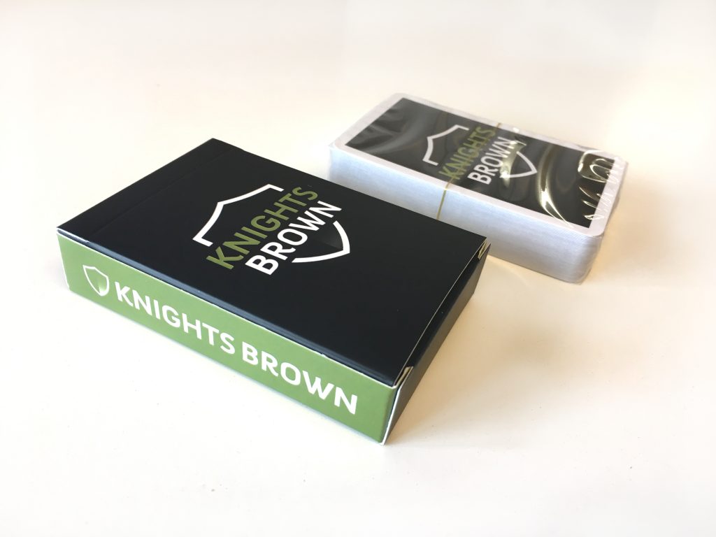
And the colour? Well, the olive green is inspired by the colours of the New Forest and it’s balanced with a dark grey.
We’re working with the team to roll the brand out, in preparation for 1 September, across all stationery, clothing, and vehicles, and have even produced a set of comprehensive brand guidelines to make sure the new brand is embedded consistently across all sites – a rebrand is no mean feat!
This has been an exciting and fast-moving project to be involved in, and it’s not over yet. We’re currently busy designing the new Knights Brown Website, watch out for it launching in the coming months – we’ll be sure to be posting it all over social media! 😉
