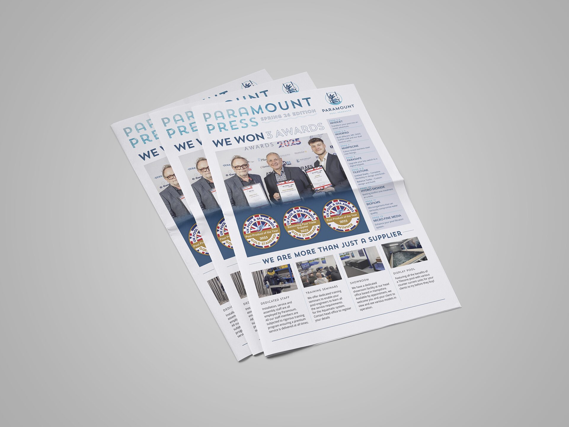
Ah, the world of design principles – where no one can quite agree on how many there are or what they should be called! But, for the sake of a bit of order (and sanity), there are a dozen trusty principles that pop up time and time again.
While these principles often get their own spotlight. They work together to create something that looks good and makes sense to the reader. The real design wizards know how to blend, reinforce, or occasionally let them clash like a fashionable pattern mix, all to create just the right vibe.
So what makes good print design?

Contrast
Contrast refers to the distinction between various elements in a design, making them stand out from one another.

Balance
Balance can be either symmetrical (with elements of equal weight on either side of a central line) or asymmetrical (with elements of varying weights positioned in relation to a line that may or may not be centred).

Emphasis
Emphasis highlights specific parts of a design to make them stand out from other elements. Alternatively, it can reduce the prominence of a component, such as fine print.

Proportion
Proportion is the relative size of elements within a design. More prominent elements are generally perceived as more critical, while smaller ones tend to be seen as less significant.

Hierarchy
Hierarchy refers to the relative importance of elements in a design. The most important components should appear dominant, while less critical elements should be visually subordinate.

Repetition
Repetition strengthens an idea or perception by repeating certain elements, such as consistent headings, recurring colours, or similar design choices.

Pattern
Patterns refer to repeated design elements, such as wallpaper or textile designs. They can also signify standardised approaches to specific components, such as top navigation layouts.

Movement
Movement refers to the flow of a viewer’s gaze through a design. The most important elements should naturally lead the eye to the next, guiding the viewer through the composition using positioning, emphasis, and other design principles.

Variety
Variety adds visual interest to a design by incorporating elements such as typography, colour, images, and textures. It prevents designs from feeling repetitive or dull.

Unity
Unity describes how cohesively the elements of a design work together. Every component should have a clear visual relationship with others to convey a unified and coherent message.

White space
White space, also known as negative space, refers to areas of a design that are left empty. It helps to declutter the design and allows individual elements to stand out more effectively.
Mastering these twelve graphic design principles will give you the knowledge to create visuals that don’t just look stunning but also speak volumes! As you play around with these principles and make them your own, you’ll develop a unique style that’s all yours. Before you know it, you’ll create designs that grab attention, captivate your audience, and inspire them.
Go ahead, start creating good print design!


