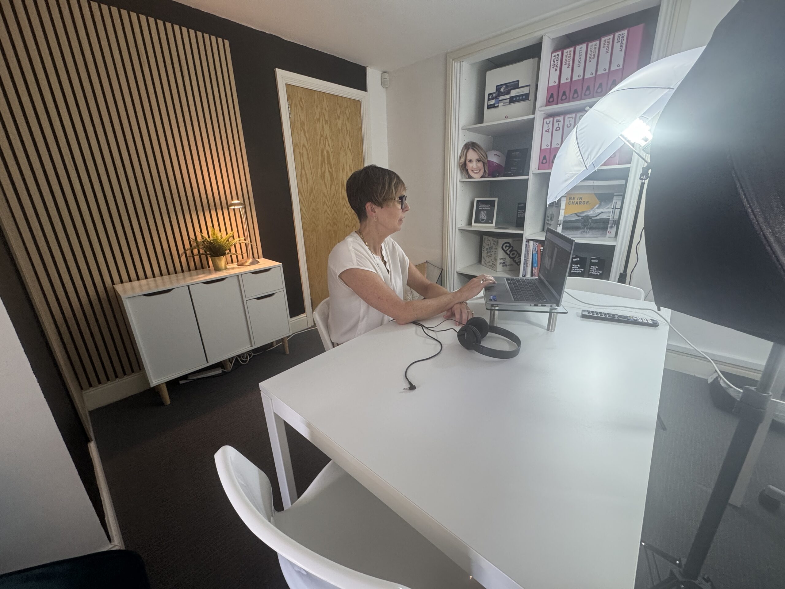
We recently rebranded the Hampshire based charity, Scarf. A fantastic organisation who coordinate regular term–time clubs, as well as holiday activities for children with special needs, and their families.
The Scarf rebrand involved creating two concept designs based on the brief provided by the client. The charity wanted to appear fun and approachable, but not childish and needed the brand to appeal to an age range of 0-25 years, as well as parents and relatives. Each Glow designer took on a concept, creating two very different designs which encompassed these requirements.
When we presented the brand options to Scarf, they had a tough call on which design to go for, but decided the contemporary wordmark was the winning logo for them. However, we wanted to dedicate this blog to the concept that didn’t quite make it.
Scarf originally provided Glow with rough illustrations of potential ideas and the thinking behind them. This alternative concept features a custom drawn icon, which takes inspiration from these ideas. Amy, one of Glow’s designers, created the concept using an iPad Pro and Apple pencil on a programme called Procreate. She experimented and tweaked the design to get it just right before progressing to Adobe Illustrator to refine the small details.
![]()
![]()
The icon encompasses the values of inclusivity, by showing different genders, races and ages. The scarf wrapping around the two individuals provides connotations of care, protection and a sense of belonging, whilst also subtly replicating the shape of a heart.
The logo utilises the original primary colour palette of blue and green, but features softer, pastel shades for a less corporate and friendlier, calming aesthetic. Retaining a link to the old branding would help to ensure a level of familiarity and creates a connection to the brand’s heritage.
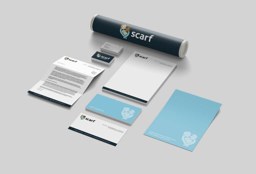
Not only did we create a logo for Scarf, we also provided colour palettes, typography suggestions and stationery designs to show how the concept would work as a complete brand.
We loved working on the Scarf rebrand and the creativity it allowed. We were delighted that the team at Scarf were so pleased with both concept designs and that it was a difficult decision for them, as this indicates to us that we really nailed the brief.